
Color perception in style affects how polished, energetic, relaxed, powerful, or approachable you appear. It works quickly because people process color before they notice most garment details. A blazer may be beautifully cut, but its color changes the feeling first. Pale blue softens a look. Burgundy adds depth. Black creates contrast. Ivory brings clarity. A refined image building approach helps you use those signals with more purpose. Dressing becomes less about guessing and more about choosing the right visual message for each moment.
No color communicates exactly the same way in every setting. Lighting changes the effect. Fabric changes the effect. Styling changes the effect. A red silk blouse feels different from a red cotton sweatshirt. A beige suit feels different in a boardroom than on vacation. A pale dress reads differently at brunch than at an evening event. Context decides whether color feels bold, soft, formal, or relaxed.
This is why the same shade can succeed in one outfit and fail in another. You must consider the whole environment. Think about where you are going. Think about who will see you. Think about the mood you want to create. Smart personal presentation uses color as part of a larger message. A shade should support the situation. It should not fight the room.
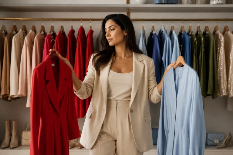
A closet feels easier when colors connect. Random shades create styling friction. You may own many pieces and still feel like nothing works together. Repeated tones solve that problem. Neutrals act as anchors. Accent colors create personality. Soft tones bridge stronger shades. Prints become easier when they repeat colors already in your wardrobe. Harmony makes outfit building faster and more satisfying.
Wardrobe harmony does not mean wearing bland clothing. It means choosing colors that speak to each other. A camel coat, ivory knit, denim shirt, and burgundy shoe can create several outfits. A bright green top may work too, but only if it has supporting pieces. Strong wardrobe color planning reduces orphan purchases. You stop buying interesting pieces that never leave the closet. Your style becomes more flexible because your colors cooperate.
Bright colors bring visibility. They can feel optimistic, playful, creative, or assertive. Their impact depends on placement. A bright bag feels different from a bright coat. A bold shoe feels different from a saturated suit. Bright shades near the face attract attention immediately. Bright shades in accessories feel easier to control. This makes them useful for people who want energy without full commitment.
Balance keeps bright colors from overpowering the outfit. Pair one vivid element with calm basics. Let the color have space. Avoid competing accents unless the look intentionally feels maximal. Strong style confidence grows when you know how much color feels right for you. A bright blue shoe can refresh denim. A red lip can sharpen neutrals. A yellow scarf can lift a simple coat.
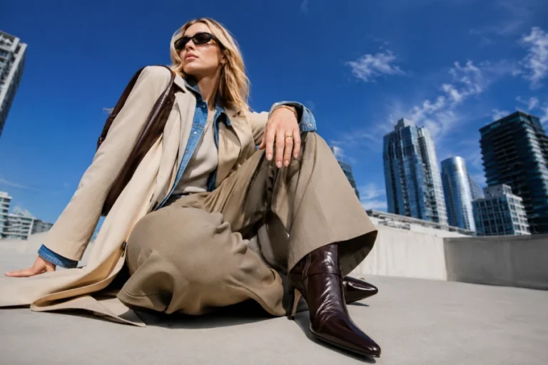
Soft colors can communicate ease, warmth, and quiet confidence. They should not be mistaken for weakness. Cream, taupe, dusty blue, blush, sage, and soft gray can look refined when fabrics and shapes feel intentional. These shades often work well in layered outfits. They create gentle transitions. They make tailoring feel less severe. They can also make casual pieces look more polished.
Soft power dressing relies on control rather than volume. A cream suit with clean shoes can feel calm and expensive. A muted blue blouse can feel trustworthy. A taupe coat can feel elegant without demanding attention. A thoughtful color message gives softness direction. The outfit still has strength. It simply communicates through restraint, harmony, and composure instead of contrast.
Neutrals are not empty background colors. They carry strong signals. Black can feel sleek, serious, or dramatic. Brown can feel grounded and warm. Gray can feel modern or understated. Beige can feel relaxed or refined. White can feel crisp and fresh. The meaning changes with texture, fit, and styling. A wrinkled neutral reads differently from a sharp one.
Intentional neutral dressing often looks more sophisticated than random color mixing. Combine different textures to create depth. Pair matte wool with smooth leather. Use denim against cream knitwear. Add black accessories for definition. A strong personal color strategy helps neutrals feel expressive instead of plain. You can look memorable without wearing loud shades. The clarity comes from proportion, contrast, and repetition.
Shopping becomes easier when color has a role. You stop buying shades that look exciting but confuse your closet. You notice which tones support your face. You notice which colors work with your shoes, coats, and bags. You also notice which colors only look appealing under store lighting. A good purchase should connect with what you already wear. It should expand options, not create new problems.
Before buying, imagine the piece in three outfits. Pair it with your most worn neutral. Pair it with denim. Pair it with your favorite shoe. If the color still works, it may deserve space. If it only works in theory, pause. A practical seasonal color awareness habit protects your budget and style. Over time, your wardrobe becomes clearer because every color has purpose.


Leave a comment