
Fashion color psychology helps explain why an outfit communicates before conversation even begins. Color changes the emotional temperature of clothing. It can make a look feel calm, bold, expensive, creative, serious, approachable, or energetic. People may not analyze your outfit consciously, but they still respond to the visual message. A clear personal color strategy helps you choose with more confidence. You begin dressing for the room, the purpose, and the impression you want to support. Style becomes less random. Your wardrobe starts working like a visual language instead of a collection of separate pieces.
Everyday outfits carry more meaning than many people realize. Navy can suggest steadiness. White can feel fresh and clear. Red can create focus. Brown can feel grounded. Black can look polished or distant, depending on context. Soft neutrals can make a look feel calm. Bright colors can create energy. The same shade changes when paired with different fabrics, silhouettes, and accessories.
Awareness helps you dress with purpose rather than pressure. You do not need strict color rules. You need to notice how colors behave. A red blazer at work sends a different signal than red shoes at dinner. Pale blue can feel gentle in one outfit and crisp in another. Smart outfit color choices let you adjust the message without changing your personality. That flexibility makes color a practical tool.
Confidence often begins with alignment. A color can make you feel more visible. Another can make you feel more composed. Some shades brighten your face. Others drain your energy. Personal response matters as much as outside perception. When you feel uncomfortable in a color, the outfit rarely works fully. You may adjust it all day. You may avoid eye contact. You may feel less like yourself.
A strong palette helps you repeat confidence. You learn which colors support your features. You also learn which tones fit your lifestyle. Some people thrive in contrast. Others look best in softer transitions. A useful signature color palette creates recognition and ease. You shop with more focus. You build outfits faster. You also stop forcing shades that only looked appealing on a hanger.
Professional style depends on subtle communication. Deep colors often feel focused. Soft colors can feel collaborative. High contrast can look decisive. Tonal dressing can look refined. The right choice depends on the setting. A creative meeting may welcome stronger color. A formal presentation may reward restraint. A client lunch may need warmth. A leadership moment may need clarity. Color helps you support those shifts.
Work clothing should never feel like costume. It should help your message land cleanly. A charcoal suit with a cream blouse feels different from a navy dress with red shoes. Both can look professional. Each says something slightly different. A thoughtful professional style palette gives you options. You can dress for authority without looking severe. You can dress for approachability without looking casual.
Trend colors can be exciting, but they are not automatically useful. A popular shade may not suit your wardrobe. It may clash with your existing pieces. It may feel forced with your skin tone. It may only work for one season. That does not mean trends should be ignored. It means they should be tested carefully. One accessory can introduce a new shade without disrupting your whole closet.
The strongest wardrobes balance freshness and consistency. You can enjoy a seasonal color while keeping your core palette stable. Try the shade near your face first. Test it with denim, neutrals, and favorite shoes. Notice whether it supports your image or demands too much attention. Strong wardrobe color planning turns trends into selective updates. You stay current without losing your personal visual direction.
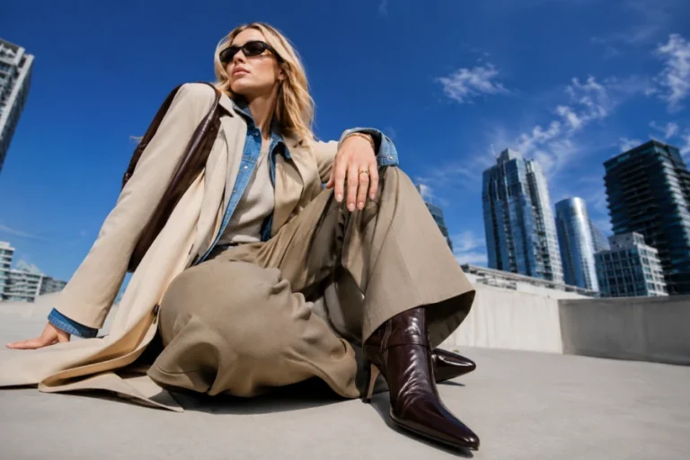
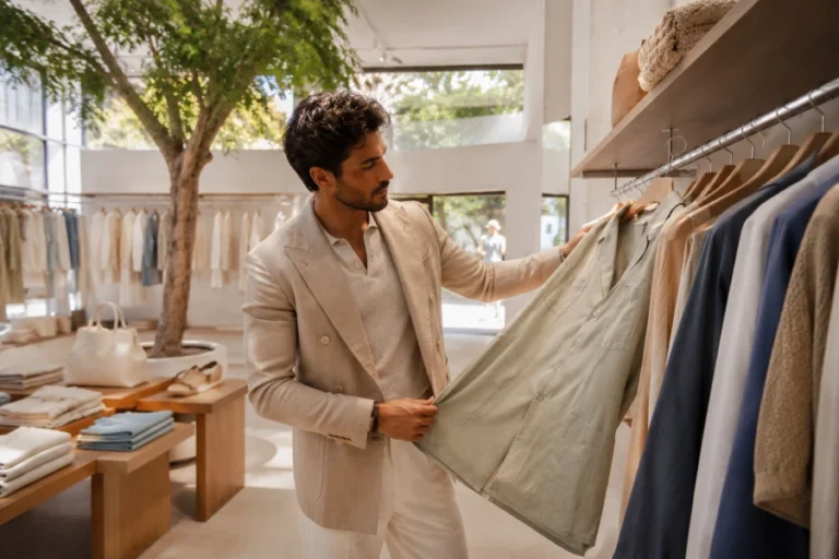
Contrast changes the strength of an outfit. Black and white can look crisp. Cream and beige can look soft. Navy and camel can feel classic. Red and ivory can feel confident. Low contrast often creates ease. High contrast often creates impact. Texture changes the effect further. Matte cotton reads differently than glossy satin. Soft wool reads differently than polished leather. Color never works alone.
Contrast also interacts with your natural features. Some people look sharper in bold combinations. Others look more harmonious in tonal outfits. This is why copying another person’s outfit can disappoint. The same colors may not communicate the same way on you. Useful fashion psychology insights help you observe instead of imitate. You learn how visual weight works. Then you build outfits that support your presence.
Color becomes powerful when it feels personal. Repeated shades can make your style memorable. A woman known for ivory and black feels different from one known for red and camel. A man who repeats navy and olive communicates a different mood than one who favors gray and white. These patterns become visual signatures. They help people recognize your taste before they can describe it.
You can start by identifying three anchors. Choose one neutral, one soft tone, and one accent color. Build outfits around those colors for several weeks. Notice which combinations earn compliments. Notice which outfits feel easiest. Notice what photographs well. Over time, color stops being a random choice. It becomes part of your personal brand. That is where intentional dressing begins to feel natural, polished, and expressive.


Leave a comment