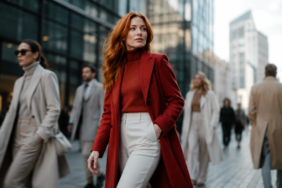
Understanding how color affects image helps you make smarter choices before you get dressed. Clothing communicates instantly, and color often leads that communication. It can soften a strong silhouette, sharpen a casual outfit, make basics feel memorable, or create confusion when used without intention. A clear visual identity brings those choices together. Your outfit begins to support your message instead of distracting from it. This does not mean dressing for approval. It means using color to express confidence, clarity, warmth, authority, creativity, or ease in a way that feels deliberate.
People notice color before they study fit. They register brightness, contrast, and mood quickly. A dark palette can feel serious. A light palette can feel open. Warm shades can feel welcoming. Cool shades can feel composed. Strong colors can create attention. Soft colors can reduce tension. None of these meanings are absolute. They shift with culture, setting, season, and personal styling.
First impressions matter because they frame the rest of the interaction. A red coat in a crowd feels decisive. A cream suit in a bright room feels calm. A navy dress in a meeting feels steady. A yellow scarf can make a simple outfit feel optimistic. Good fashion psychology insights help you read these effects. You choose what supports the moment. The outfit becomes less accidental.
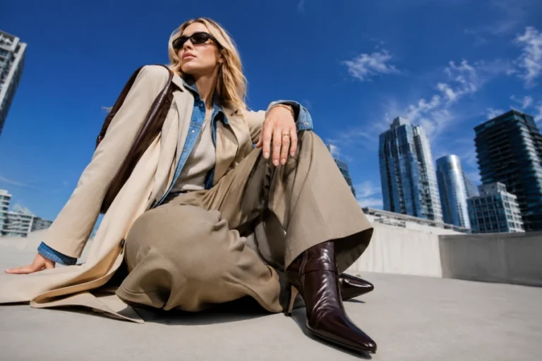
Contrast changes visual authority. High contrast draws the eye quickly. Low contrast creates softness and flow. Tonal dressing can look elegant. Sharp combinations can look direct. Black with ivory feels different from beige with cream. Burgundy with camel feels different from gray with navy. The strongest choice depends on your features, your mood, and the setting. Contrast should frame you, not overpower you.
Your natural coloring also influences the result. Some people look energized by bold contrast. Others look more polished in muted combinations. This explains why a copied outfit may not translate well. The colors may work on the original wearer but feel harsh or flat on you. A useful personal color strategy helps you adapt inspiration. You keep the idea while changing the palette. That makes the look more personal and more effective.
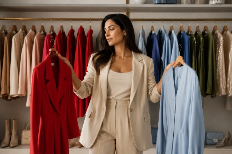
Different days ask for different signals. A presentation may call for clarity. A date may call for warmth. A creative meeting may welcome expressive color. A formal dinner may reward restraint. A travel day may need comfort and practicality. Color helps you shift tone without changing who you are. You can stay recognizable while adjusting the message. This is one reason strong personal style feels flexible.
Role-based dressing works best when it stays authentic. You should not wear a color that makes you feel uncomfortable just because it signals authority. Instead, find your version of the message. Authority might be navy for one person and deep olive for another. Warmth might be blush, camel, rust, or soft blue. Strong outfit color choices help your clothes support your purpose. The right shade makes the role feel natural.
Trend colors can make wardrobes feel fresh, but they can also create short-lived mistakes. A popular shade may look exciting for a month and difficult afterward. Another trend color may become a lasting favorite. The difference usually depends on whether it fits your existing palette. A color should connect with pieces you already own. It should work with your shoes, bags, outerwear, and preferred neutrals.
You can test trends without rebuilding your closet. Try a scarf, belt, shoe, or small bag first. Wear the shade with your everyday basics. Notice whether it feels useful or forced. A flexible seasonal color awareness habit keeps experimentation smart. You avoid building an entire outfit around temporary excitement. Your image stays current while your wardrobe remains coherent.
Repetition helps people remember style. A repeated color becomes part of your visual signature. It may be camel coats, ivory tops, burgundy accessories, black tailoring, navy dresses, or soft blue shirts. The exact color matters less than the consistency. Repetition creates familiarity. Familiarity creates recognition. Recognition makes personal style feel stronger. People begin to associate certain shades with your presence.
This does not mean you must wear one color forever. It means your wardrobe needs anchors. Accessories can repeat those anchors easily. Shoes, belts, bags, scarves, and outerwear carry strong visual weight. A polished signature color palette connects outfits across seasons. You can still experiment. The experiments look more intentional because the foundation stays recognizable. Style grows through pattern, not constant reinvention.
Small wardrobes depend on color discipline. Every piece needs more usefulness. Random shades reduce outfit options. Coordinated colors multiply them. A cream sweater, dark denim, black shoe, camel coat, and burgundy bag can create many combinations. Add one unrelated color, and the closet may become harder to style. Limited space rewards clarity. Color choices must serve more than one outfit.
This approach supports both budget and confidence. You buy fewer pieces because each purchase must work harder. You get dressed faster because combinations make sense. You also reduce visual noise. Thoughtful wardrobe color planning makes a smaller closet feel more complete. Your image becomes clearer because your colors repeat with purpose. Less clothing can create more style when the palette works together.


Leave a comment